Thursday, October 28, 2010

Left vs Right

Photobucket

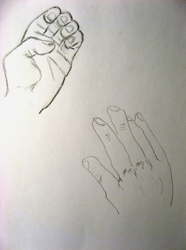
The last time I drew my hand as subject matter was in 1995, when I was in high school.  It was definitely different this time around, one being I drew every day in those days and now I barely ever draw.  The other drawback is I inured my right hand riding my 4 wheeler, so this isn't my full potential, but it's as close as it's going to get. 
I used pencil instead of charcoal, because I have used pencil more than anything to sketch.  Drawing my nondominant hand felt like me drawing at 4 years old.  Pretty sad, but actually it looks better than I thought it would. 
If this were a successful study, I’d say the results would be first place goes to the right hand, and last place goes to the left.  I would say that with practice though, I could probably draw with my left hand.  I would probably use my left hand to paint abstract, but that's about it.

Week 9 Video Review

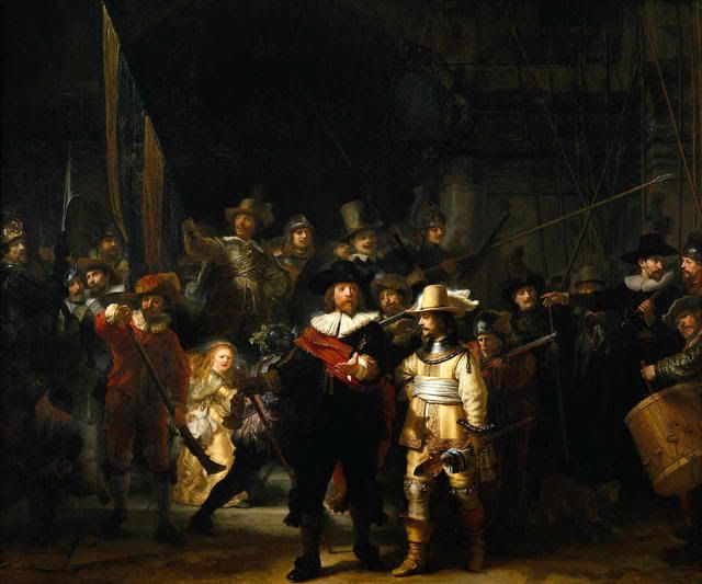
 Night watch-Rembrandt Pictures, Images and
Photos
Rembrandt’s “Night Watch” was a painting with large scale and a big achievement of a painting with much movement, and that is why I chose this video.  Rembrandt captures a moment in time here, and this given moment is the troops are getting orders to start marching.  There is no stationary element in this painting, shadows are cast, and three dimensions are achieved.  I learned that if this picture was not captured at this very moment in time, the impact would not be the same.  It would have changed everything.

by Leonardo da Vinci Pictures, Images and
Photos

In the video “Leonardo Da Vinci: The Mind of the Renaissance,” I learned that the more educated, the more intricate work and the more worthy of its praise.  Leonardo first became a master of perspective, and also mastered proportions of man and animals.  I also learned if you take different parts from more than one other various real creatures, it can make an imaginary creature look real and believable. 

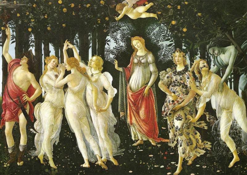
La Primavera Pictures, Images and
Photos

“La Primavera.”  I learned that egg tempura was used in this painting.  Even though it was an older medium, and oil paints were more current, it was used to give an illusion like translucence appearance.  Flesh tones are made very realistic with this paint and detail is apparent and realistic.  I chose this video because tempera is a medium I enjoy using, and I like the vibrancy of the colors with this paint.

David and Goliath Pictures, Images and
Photos

“The Power of Art: Caravaggio,” was a video on a Roman painter named Caravaggio.  I picked this video, because I was curious to find out who this person was, and what did he do?  I learned Caravaggio never learned to draw in his life, he just learned how to paint.  Most artists studied the human body and structure.  Not Caravaggio, he eyeballed his subjects and applied them to the canvas.  He objected to the standards of artistry and their concepts, painting in the style and steps he felt right.  He replicated the lives subjects exactly and one feels like the characters in the painting could come to life at any time.   Caravaggio’s replication of flesh tones made his paintings believable and so realistic.

I thoroughly enjoyed this week's videos, as they discuss some of the same key concepts, but also shed more light on the text with more in depth discussion.  It was more descriptive and thorough on the backgrounds and history of the artists and their works. 


Tuesday, October 19, 2010

Week 8 Video Review


1. Explain why you selected each of the three videos you choose from the selection listed above.

I selected the video on the Greeks because I find their obsession with the human form and its perfection fascinating.  I believe the body is beautiful, and we should work hard to take care of it, like we take care of our homes, cars, bills, and etc.  I am fascinated with gothic structures I think they’re beautiful and eerie at the same time.  I also think the Egyptians were an amazing culture, and they had some great ideals and culture.  Their art is elegant and mysterious.

2. For each video list/discuss the key concepts you learned.

In “More Human than Human,” I learned the Egyptians always drew their figures from the clearest angle, and their style was unchanged for 3000 years.  Like others and today’s depiction of figures, they’re all unrealistic, resembling exaggerate features.  They did this because their culture was of consistency and this was something their culture had been built on.
In “Cataclysm: The Black Death Visits Tuscany,” the people portray god as a very vengeful god, and the Old Testament is focused on.  The Plague is seen as punishment and churches and mosaics give homage to God and portray forgiveness for faithfulness.  The way into Heaven comes by goodwill and faithfulness, whereas those who didn’t were going to hell.
“The Measure of All Things: Greek Art and the Human Figure,” I found, like in the book the Greeks were obsessed with each other’s bodies and their perfection.  They all worked out and strived for perfection, and would analyze each other to achieve this.  The Greeks focused on realism, movement, shape, and 3 dimensional arts.  They wanted to give their art a soul, as if they were real, as if they could actually start moving. 

“Playlist: Late Gothic Art and Architecture: England, 1400-1547,” I learned Gothic Art was sophisticated and meant to out do the others, and create something more lavish and beautiful.  This gave the churches an image of power and divinity. 

3. How do the videos relate to the readings in the text?

The videos related to the text and expanded on the readings.  The Greeks love for beauty was sown in more detail and the historians account for them gave new understanding of the depth of their obsession with the human form.  I liked the additional visuals on the gothic period, and the better understanding of religion’s darker side during the Black Plague. 

4. What is your opinion of the films? How do they add depth to understanding of the readings and art concepts?

The films definitely add more depth of the text.  It expands on the research and the different views of other people.  They are intellectually stimulating and add to the readings.
Friday, October 15, 2010

Week 7 Video Review


1. For each video list/discuss the key concepts you learned.
In a video I watched on Prairie Style, I learned Frank Lloyd Wright invented this concept.  I have been to two homes here in New York, and am familiar with him, but not his Prairie Style.  This concept of his was responsible for breaking the mold of the box shaped house.  He felt it did not blend well with the environment, felt rectangles and elongation of a home made it more organic and made it easier to customize to complement a landscape.  His view was that the home should complement its environment and the environment should do the same to the homes He built.
Taleisin West Pictures, Images and
Photos
I learned that the Romans and Greeks used concrete in their structures.  I thought they were similar to Egyptian structures and made of mainly large carved stones.  Concrete is so weather resistant, strong and easily repairable.
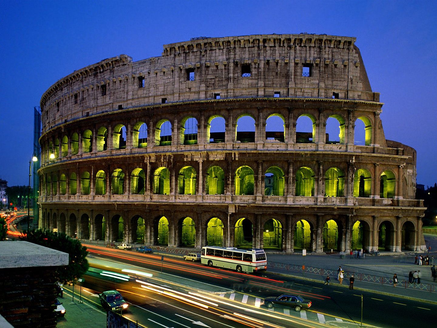
In the last video I was amazed to learn the Romans not only invented the arch, but they were the first to use arches and column for the purpose of design.  The Coliseum is one structure that represented this.
Coliseum Pictures, Images and
Photos
2. How do the videos relate to the readings in the text?
The videos expanded on the definitions of architecture in the text, by giving examples and visual cues on the subject matter from the text.  The showed some of the processes talked about in the text, so that we could see things from a different perspective. 
3. What is your opinion of the films? How do they add depth to understanding of Architecture?
I found the films highly knowledgeable, although I did have a hard time understanding what people were saying.  Again film always adds a new depth on things, when comparing to read about them.  It always broadens my understanding of things when I see a video or something acted out. 
4. From the group of four that you had a choice: Why did you choose that film?
I chose the video, “Last Call for Planet Earth: Sustainable Development and Architecture,” because the environment is a great concern of mine, and I have been conscious of the damage we have caused over the years.  I do believe we are in a decline and have to change our uses in energy and waste management.  I think we can reverse the negative effects if we change now.  Otherwise we will see adverse effects.  When I looked through the choices of videos, this one seemed the most appealing, because I wanted to see what we plan to do to conserve, and to consume less energy by being more efficient as humans in our everyday life.  I agree that people think they are external, and the world is theirs to use up, without thinking how it will affect future generations. 

My Video Review

1. for each video list/discuss the key concepts you learned.

I did not know there were so many steps when sculpting marble.  You have to consider the elements and the design and fragility involved.  The sculpture has to be weighted right and be visually appealing at the same time.  You also have to worry about breakage when handling or shipping.  There is so much planning involved and each piece has to be processed exactly right for the whole piece to come together and portray the artists vision of the work. 
When glass making, I knew they heated sand with other elements, and I knew that the glass was inflated by blowing air through a tube.  I did not realize how the object was shaped and perfected.  I did not know they used molds or even wet newspaper to shape the piece.  Cementation was also another technique I was not aware of.  I thought the glass was made that color and placed in its coordinating place. 
The Romans used columns as decoration and also invented the arches. They started the use of concrete to form designs in their architecture, and the use and design of their columns gave different meanings to complement their buildings.  This style is still used today.

2. How do the videos relate to the readings in the text?
These videos follow the reading in the text, because they follow the same concepts involved in each art form.  It gives us a visual of the art and is more helpful by showing the process and visual meaning of the arts for a more complete understanding.  I learn better by watching someone doing something, rather than reading how to do it for example.

3. What is your opinion of the films? How do they add depth to understanding of the topics: Sculpture, Installation, and Craft?
The films give more depth and add to the readings in the textbook.  It’s one thing to explain something or a process in words, but it’s another to see how it’s done visually.  One can greater appreciate the art and how it’s done, by seeing the process and how time consuming it really is, and the thought processes and steps taken to carry it through.  It’s almost like the viewer of the video works with the artist thought the whole process with anticipation.

4.  From the group of four that you had a choice: Why did you choose that film?
I chose the video, “Last Call for Planet Earth: Sustainable Development and Architecture,” because the environment is a great concern of mine, and I have been conscious of the damage we have caused over the years.  I do believe we are in a decline and have to change our uses in energy and waste management.  I think we can reverse the negative effects if we change now.  Otherwise we will see adverse effects.


Sunday, October 10, 2010

Enviremental installation of Art


Photobucket

Installation art is installed and arranged in a place, either inside or outside.  This work is created by the artist or by other artists, as the main artist tells them to. Whether it's temporary or permanent, installation art can be constructed of virtually any material that the artist wants.  These materials that are chose are used carefully to create the installation.  Installation art is a creative extension of a room in the artists mind.  It is a way to create or recreate what the room is or what the room should be according to an artist.  We make it for personal satisfaction of how a room makes us feel, and how we want to make others feel when entering the room.  Richard Wilson’s “She came in through the Bathroom Window,” I found most interesting.   He used a room’s skylight to cast an image over waste oil, to project an exact mirrored image of the ceiling’s architecture.  You would never know it was oil, until you dipped your finger in it, and created a ripple in the reflection.  It is brilliant and inspiring. 

Photobucket


When creating my installation, I wasn’t inspired by any certain piece or artist.  I thought for a long time about which room in my apartment I felt the most emotion and artistically connected with.  That room would be my porch, as it’s an extension of me and one of my passions in life.  I wanted to explore the Environment theme of installations, and my medium will be plants and organic décor.  I feel a connection with the earth and all of its creation, and am emotionally tied to them.  I spent all spring sowing seeds and watching them grow from sprouts, to summer watching my plants bloom, to fall harvesting tomatoes.  I can’t tell you how many countless times I rearranged plants, stands, and other furniture to get the right feel and balance in this room.  With all this moving this and that, I finally have it right, and it figures winters around the corner.  So I am finally enjoying the work, with only a short while until the first frost hits. Next spring will be a new pallet (new apartment) and new sprouts.   I can’t wait!

Photobucket


Thursday, October 7, 2010

My Peer Review

Amber Castoire’s


Jenna Aiello’s Project 1 ?


When looking at Project #1: (Elements and Principles), did you agree with the element or principle the artist listed with the images? Did you see other elements and principles in the images?

Amber had some nice images that you would see in an everyday family photo album.  She saw principles and elements in these wonderful family moments and other photos.  Her form photo also had the elements of color incorporated.  I would say most of her photos had many elements and principles in each individual photo.  Jenna did not have a project 1, so naturally I went to her sister’s blog.  She also had photos that had multiple elements and principles in each. 

When looking at Project #2: Where there any images in the Peer Blogs the same as your own? If yes, what were they? Where the reasons the image was selected the same or different as your own? 

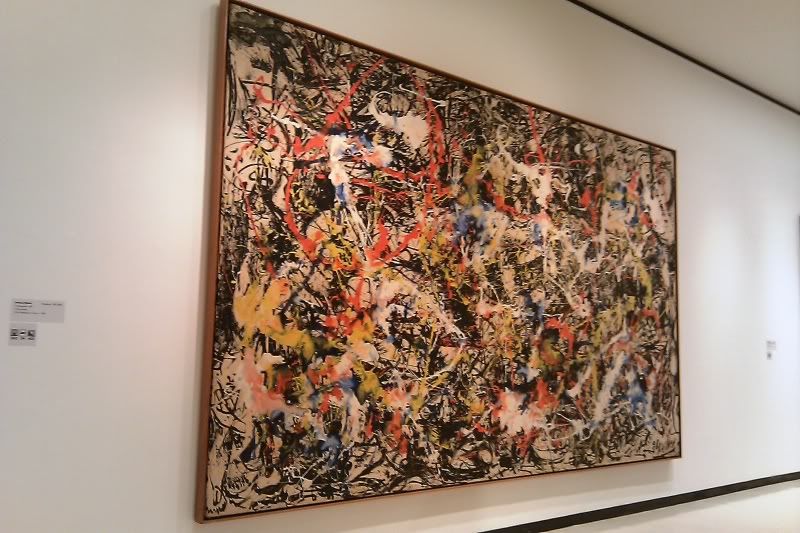
“Convergence,” seemed to pop up in everyone’s blog, and most felt the same things as me.  No one wanted to walk away from the painting.  Everyone was drawn to it, like it was alive and trying to reel us in.  Amber liked it because it looked like graffiti or splatter paint, while others were drawn to its complexity.
Where there any images that you’re Peers selected that pique your interest now? If yes, what are they and what is your connection with them? What would you want to know about them?
The picture that stood out to me the most was the Norman Rockwell painting of the little girl, with the gent painter her doll bed.  This is so photorealistic, and the emotion captured is better than a photograph.  It is very timeless and I could stare at this photo forever wondering what he and she is thinking about. 

What do you think about the process of reading your peers reflection? Do you find this to be a valuable in your learning?

I like to compare and contrast what they have to say and feel, to what I do.  I like to know whether others feel the same or different as me.  Also I like to see if anyone makes mention of tings I don’t see, and it opens up new doors to different meaning and interpretation.  This expands horizons and my realization and absorbing new things.

Check your Blog and read comments posted by your Peers. Do you find their comments helpful?

I thought my peer comments were very helpful.  Somehow my blog address got mixed up with Jenna Fanara’s and people thought I was her or she was me.   I guess it’s nice to have an alias, and I’d like her name much better than Marty, if I were a girl of course.  It made me feel good about my photography, and I didn’t realize how much into nature I was, until they started pointing it out.  It’s nice to hear comments that are outside of the box.  I like this whole blog posting thing, and what I get out of it.  I like to see other people using their creative outlets.  Bravo!


Wednesday, October 6, 2010

My Video Review

1. for each video list/discuss the key concepts you learned.
I did not know there were so many steps when sculpting marble. You have to consider the elements and the design and fragility involved. The sculpture has to be weighted right and be visually appealing at the same time. You also have to worry about breakage when handling or shipping. There is so much planning involved and each piece has to be processed exactly right for the whole piece to come together and portray the artists vision of the work.
When glass making, I knew they heated sand with other elements, and I knew that the glass was inflated by blowing air through a tube. I did not realize how the object was shaped and perfected. I did not know they used molds or even wet newspaper to shape the piece. Cementation was also another technique I was not aware of. I thought the glass was made that color and placed in its coordinating place.
Installation art is about making you artwork come out as part of a structure. Its sole purpose is to manipulate space and perception. This makes the observer or viewer to look at three-dimensional space in a different and new way.

2. How do the videos relate to the readings in the text?
These videos follow the reading in the text, because they follow the same concepts involved in each art form. It gives us a visual of the art and describes the process and meaning of the art.

3. What is your opinion of the films? How do they add depth to understanding of the topics: Sculpture, Installation, and Craft?
The films give more depth and add to the readings in the textbook. It’s one thing to explain something or a process in words, but it’s another to see how it’s done visually. One can greater appreciate the art and how it’s done, by seeing the process and how time consuming it really is, and the thought processes and steps taken to carry it through. It’s almost like the viewer of the video works with the artist thought the whole process with anticipation.

Sunday, October 3, 2010

My Art Gallery Visit

1

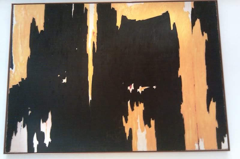
Clyford Still’s painting; “No. 1.” painted in 1957, struck me at first glance, and immediately felt a connection to it. It took me to a place of suffering and pain. It was a wall sized painting, that felt larger than life and immersed me I it. It looked like a cavern with dark walls and cliffs overflowing with lava.

2

Jackson Pollocks’s “Convergence,” painted in 1952 as oil on canvas, was wall sized and very attractive. There is so much color and motion, and it had a huge impact on me. I could stare at this piece all day, as I was mesmerized by the textures and it’s three dimensional attitudes. It’s very animated and full of life.

3

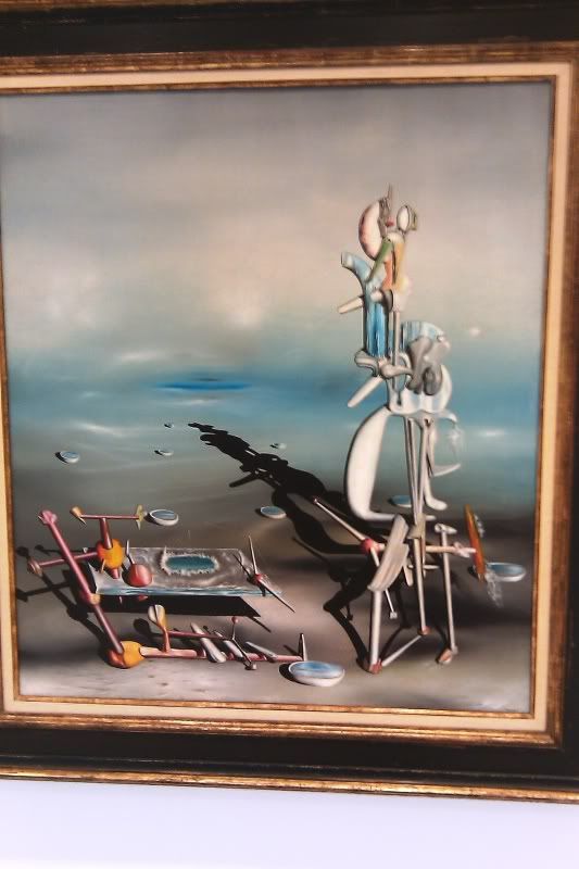
Yves Tanguy’s oil on canvas painted in 1952 is an amazing abstract and so full of visual stimulation. It’s so intellectual and intelligent in design. I would like to know more about what the organic forms in the painting represents. I want to know if this was something out of a dream, or in the artists head.

4

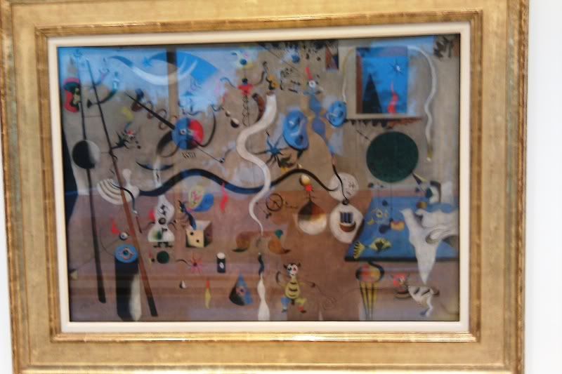
Joan Miro’s “Carnival of Harlequin,” is a fantastic oil painting on canvas from 1924-25. I love how busy this painting is. Each character has its own thing that it’s doing and it’s like a little carnival. I was drawn to how amusing and colorful this painting is. It’s very entertaining and I stared at it for about 5 minutes. I liked feeling it gave me, as I am a very humorous person.

5

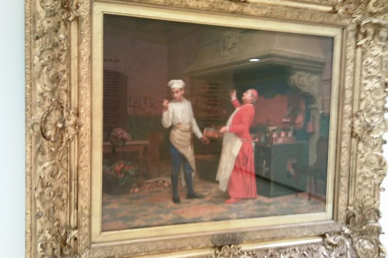
Jehan Georges Vibert’s, “The Marvelous Sauce,” is such a vibrant and detailed painting, done in oil on wood. My first impression is that is was a photograph, but to my surplice was oil on wood done 1890. The clothing is so detailed and in vibrant red. The emotion of the sauce can be seen in the impressions of the subject’s faces. Amazing, I can’t go on about this photo’s clarity.

6

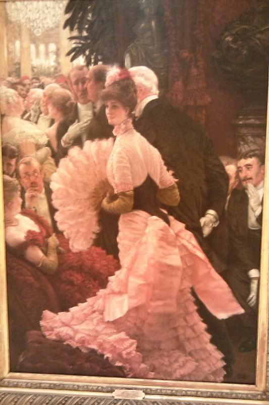
James Jacques Joseph Tissott’s oil on canvas wall painting is so surreal that I would like to have seen this moment. He did a great job capturing the moment. I can hear lavish music and loud chatter and conversation. I would have liked to know more about who this female political figure was, and why everyone is so mystified by her presence.

7

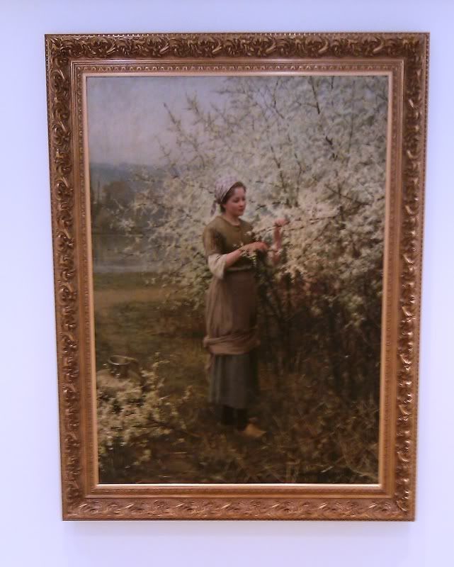
By far my favorite painting is by Daniel Ridgeway Night, called springtime. Painted in 1890 with oil on a large canvas, the girl in the painting is done with such clarity and detail; it’s as if she’s alive. The background and foreground though are not in as much detail when you are up close. Take five steps back, and it’s as if you could step into the painting. I feel connected with this piece, and it makes me feel at ease.

8

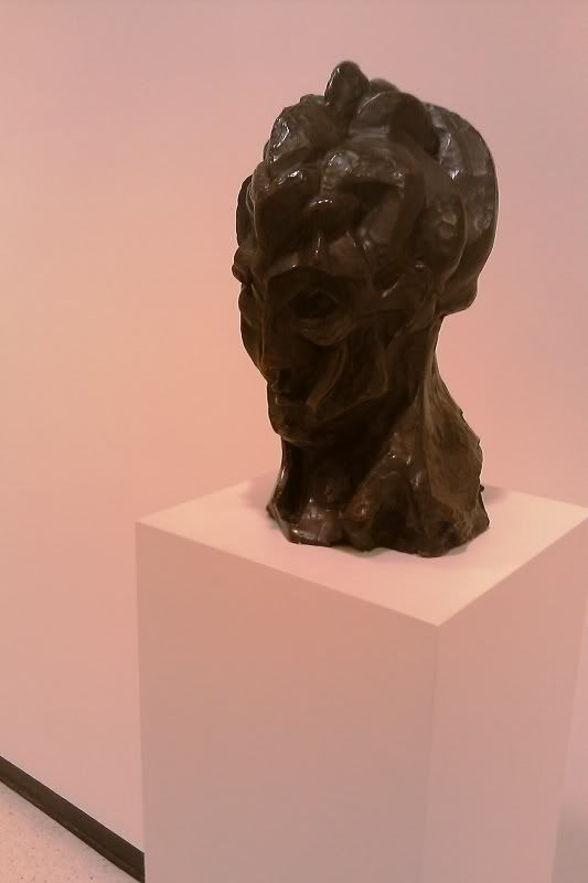
Pablo Picasso’s bronze sculpture called, “Woman’s Head,” is a very interesting piece. It’s very organic and almost looks as if she is transforming into something else. I would be interested in knowing what Pablo was thinking, who this person was, and what he was trying to do with it.
9

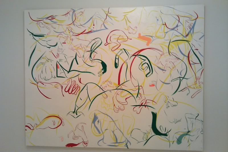
I find this Sue Williams picture very comical, anatomical, and very interesting. In her 1997 Oil on acrylic on canvas, she seems to take a very cartoonish take on abstract anatomy. I find it very comical and interesting. I feel connected to it, as I love cartooning and its spacing is perfect.

My Logo Design

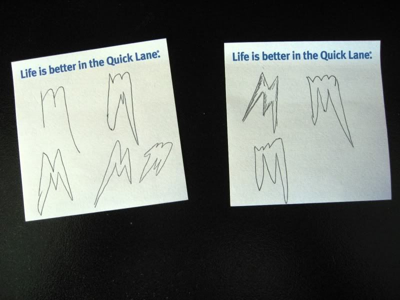
When I thought about creating my own logo for this project, I first had to think about what kind of company or product would I want? What do I like that's exciting, and what would create drive and excitement for that. There's nothing more I love doing than riding my ATV in the mud and on trails. I loved playing in dirt as a small child and I still do!

I turn this...

Photobucket

Into This!

Photobucket

This process started at work, where I spend most of my time, unfortunately. I started doodling on sticky notes. I know most off-road racing products that stick in are three letter logos, like FMF and HMF Racing. So I figured, why not one letter? So I went with M. It's simplistic yet easy to remember with a nice logo to follow it up.

Photobucket
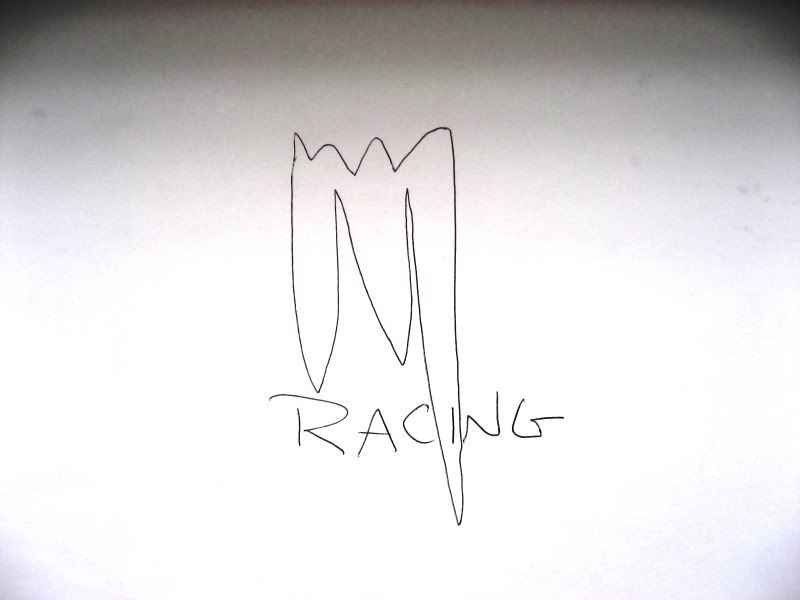
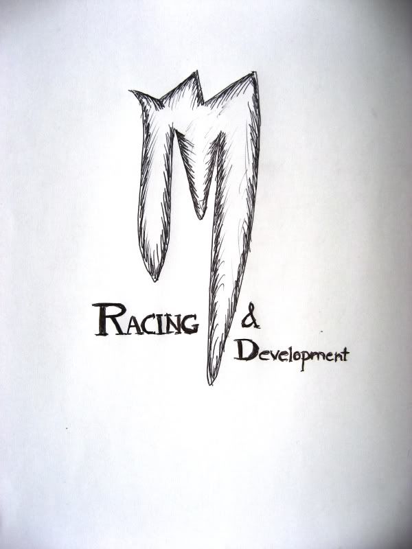
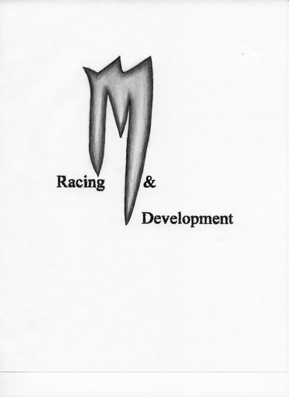
I discovered that a letter is powerful, in how it presents itself. So I went with the M that reflected that. Racing parts and clothing need to be durable and with stand punishment, and actually give punishment back to those elements which try to breakdown our equipment. So I made the M like a sword, powerful and sharp edges. The design is clean and to the point, literally!

Photobucket

Final quick sketch
Final Logo

I learned through power points and videos how logos and symbols appeal to people by their design, direction of movement and shape. People associate with designs from experience and gain loyalty or hatred of them depending on these experiences. Logos are used from signs that re meant to obey, to symbols or emblems of heritages and bloodlines. We see and react to logos everyday and in many different ways. Since the beginning time we have sought to communicate with logos and signs.